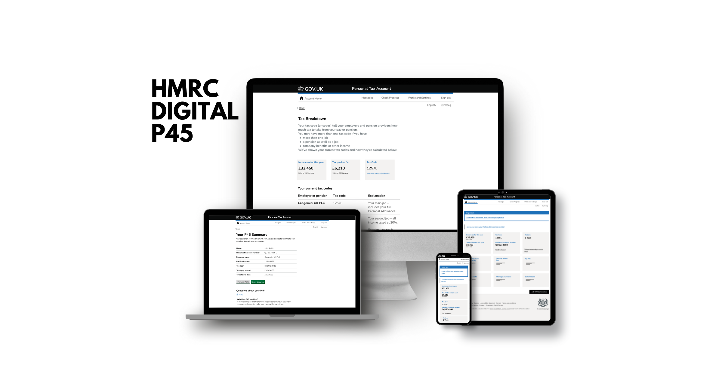
HMRC New Starter Service
A GOV.UK-style service that helps first-time employees handle tax, P45s and PAYE without panic.
Designed during the Capgemini UX Bootcamp and presented to senior UX leads, this prototype focuses on clarity, accessibility, and reducing cognitive load for new starters.
Overview
Starting a new job in the UK comes with confusing admin: tax codes, previous employment details, P45 uploads, starter checklists, PAYE. Most people don't understand what's required, and the current experience is scattered across guidance pages, PDFs, and jargon-heavy forms.
This project redesigns that journey as a single, task-led online service. It guides new starters through uploading or requesting their P45 and confirming employment details using plain language and step-by-step screens, following the GOV.UK Design System.
Problem
New employees (especially in their first job or first UK job) don't know:
- what a P45 is,
- whether they even have one,
- what they're supposed to do with it,
- how it affects being paid correctly.
The current flow overwhelms users with form fields, edge cases, and wording like "PAYE" and "starter declaration" without context. That leads to:
- anxiety about "doing it wrong,"
- wrong or missing data sent to employers,
- people getting emergency tax.
"How do we support a new starter through only the steps that apply to them — without forcing them to understand HMRC-speak?"
Research & Insights
We treated this like a public service problem, not a shiny app.
User needs analysis
We gathered user needs from interviews, case studies, and scenario walkthroughs (for example: someone starting their first job vs someone changing employers). We then:
- Counted how often each need appeared.
- Rated each need's impact on the user's ability to get paid correctly.
- Plotted them on an Impact vs Frequency matrix.
High-frequency + high-impact needs (top priority in MVP):
- 1."Tell me what I need to do right now, in order."
- 2."Help me upload / request my P45 without guessing the terminology."
- 3."Confirm I've done it right so I don't worry about tax later."
Lower priority:
- Edge-case tax circumstances.
- Deep PAYE explanation (can live behind expandable help instead of in the main flow).
Accessibility expectations
From the start, we assumed:
- Users might be stressed, neurodivergent, or English-not-first-language.
- Some users are on mobile.
- Some users are using assistive tech.
So we committed to:
- One question per screen.
- Clear headings that match the user's task ("Is this your last employer?" not "Employment history confirmation").
- Error states written as help, not blame.
Design & Process
This is where your public-sector thinking comes through.
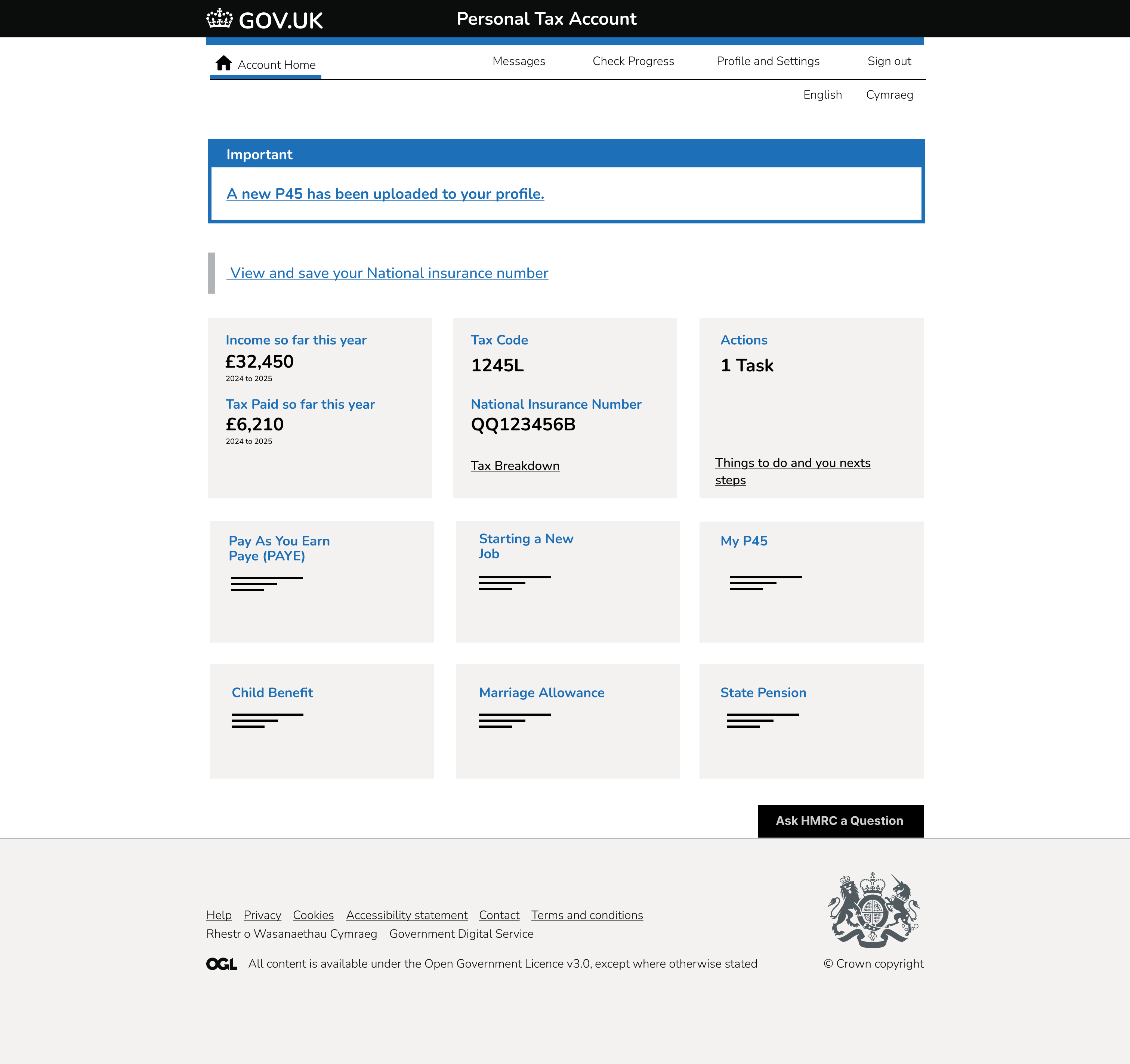
1. Task-led homepage / dashboard
Instead of dumping guidance and links, the service presents a "Here's what you need to do as a new starter" task list. Each task is a plain-English action, not a policy label.
The three main journeys we designed and showed in the final presentation were:
- New starter process / first-time job starter
- P45 request or upload
- Sharing P45 with new employer
2. One-question-at-a-time flow
We reworked the P45 flow into a GOV.UK style step-by-step form:
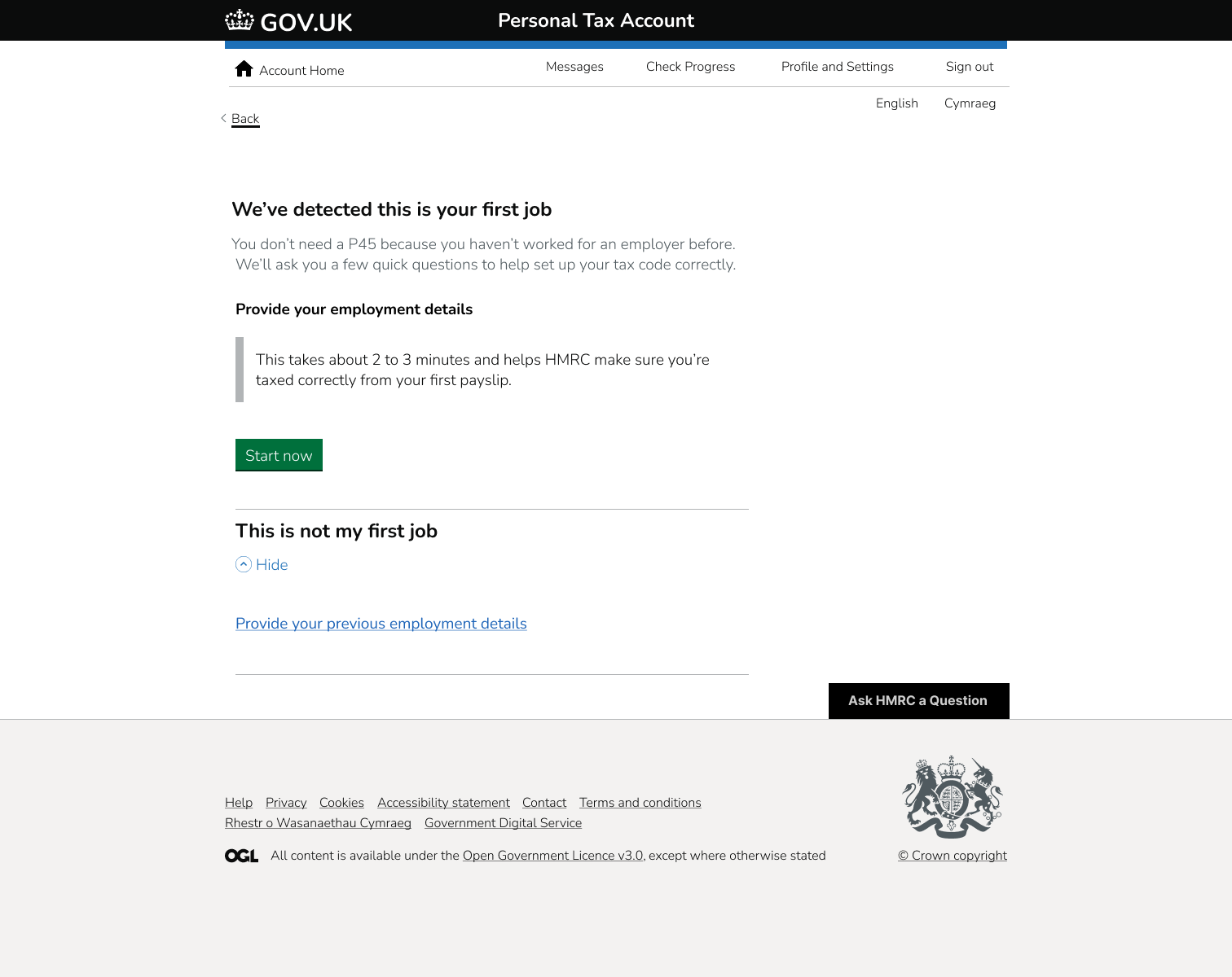
Screen 1:
"We have Capgemini UK PLC as your last employer. Is that correct?"
[ Yes ] [ No ]
- If Yes → We can automatically request your P45 from that employer on your behalf. You just confirm permission.
- If No → You pick your actual last employer from a list / type-ahead. Then we continue.
Screen 2:
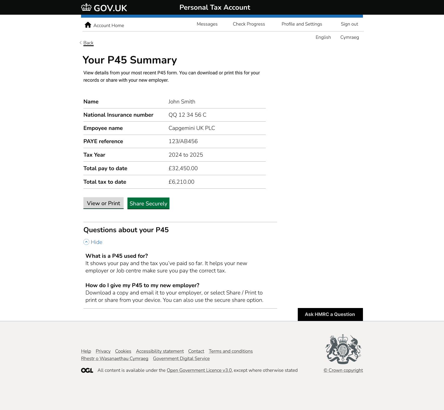
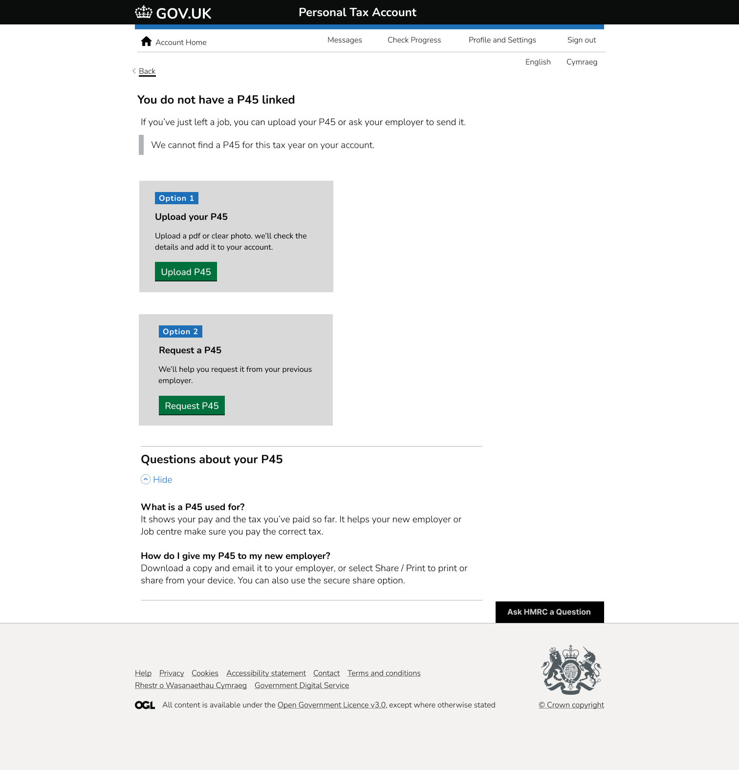
If you already have a P45:
"Upload your P45"
This uses the standard GOV.UK file upload pattern with guidance on acceptable formats and what happens next.
If you don't have it:
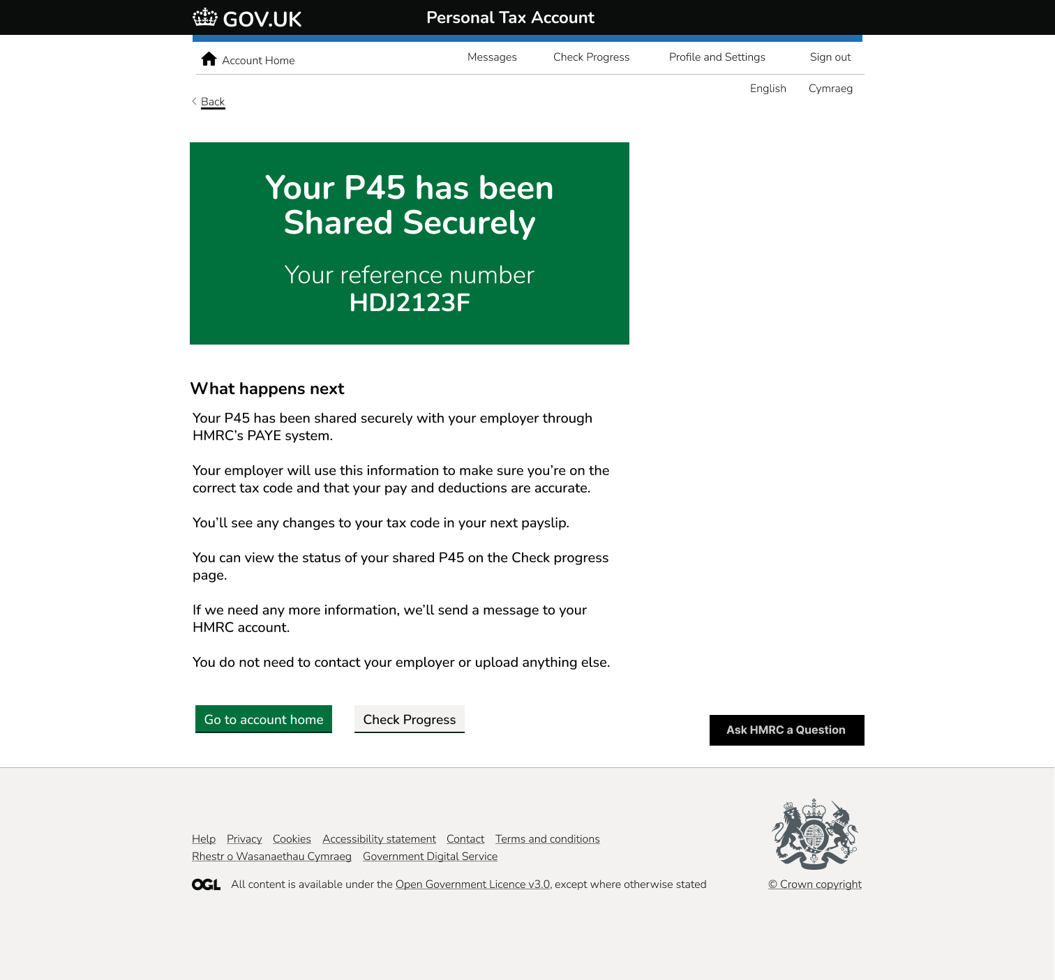
"We'll request it from your previous employer and send it directly as part of PAYE, so you don't have to do anything else."
That last point is important and was explicitly called out in your presentation: sometimes, the correct answer is "You're done. We'll handle it." That reduces unnecessary user action.
3. Plain language
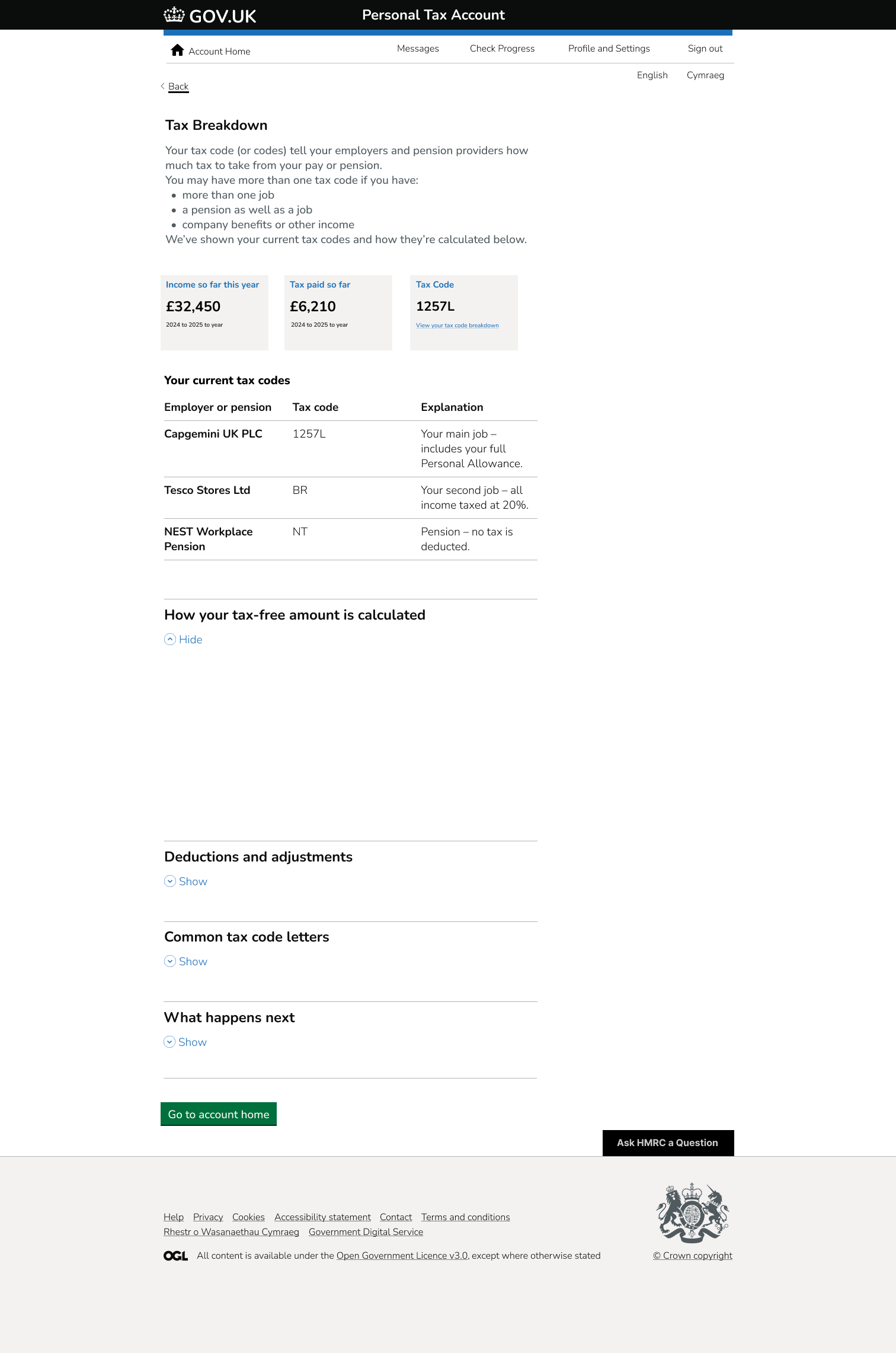
No policy jargon on primary screens. Technical terms (PAYE, tax code, etc.) are still available, but behind disclosure components: "Why does this matter?" → expand if you care.
4. Accessibility baked in
- WCAG 2.1 AA alignment in structure: heading levels, input labels, focus states, error summary at top of the page.
- High contrast.
- Keyboard/tab order modelled after GOV.UK components.
- Content designed to work for screen readers in a predictable left-to-right, top-to-bottom reading order.
5. Value proposition framing
You produced a value proposition table for stakeholders that clearly tied:
- user pain,
- proposed solution,
- measurable benefit (reduce confusion, fewer payroll errors, less contact with HR/payroll support),
- delivery risk / complexity.
That's mature. Hiring managers love that.
Solution
The final prototype is a focused, accessible HMRC-style service that:
- tells first-time or switching employees exactly what they need to do,
- guides them through employment verification and P45 handling,
- either collects the document OR automatically requests it,
- reassures them that payroll will have what it needs.
Outcome & Impact
- Presented to senior UX mentors at Capgemini and praised for:
- clarity
- accessibility-first thinking
- how closely it followed GDS patterns rather than reinventing them
- MVP scoping / value prop articulation
- I demonstrated:
- ability to translate messy gov/payroll logic into a task-led journey
- ability to defend decisions ("why this screen exists, why this screen doesn't")
- ability to speak to risk, not just UI visuals
Project Details
Role
UX Designer / Service Designer
Duration
Sept 2025 – Oct 2025
Context
UX Bootcamp (Public Sector Simulation)
Tools
Figma, GOV.UK Design System components, GDS content style, accessibility guidelines
Focus Areas
User needs mapping, journey design, form flow design, value proposition, stakeholder presentation