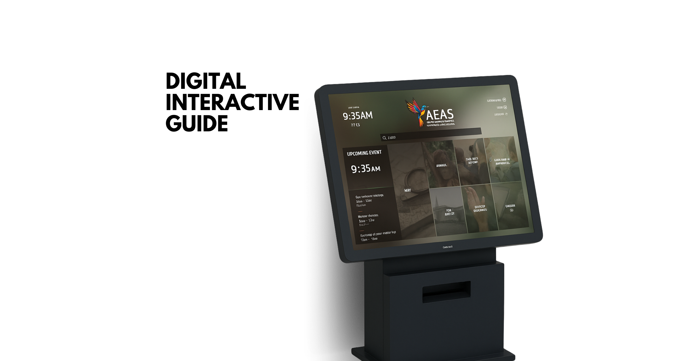
AEAS Interactive Kiosk
An interactive digital experience designed to enhance visitor engagement at the Aston Endangered Animal Sanctuary.
A Figma-based touchscreen prototype created for Aston University’s Interaction Design module , combining usability, storytelling, and accessibility to deliver a clear and engaging visitor journey.
Overview
The Aston Endangered Animal Sanctuary project was a design challenge to create an interactive touchscreen kiosk for a fictional wildlife sanctuary.
The goal was to help visitors explore animals, events, and programmes through an interface that felt educational, accessible, and easy to navigate in a public setting.
The final outcome was a high-fidelity Figma prototype that translated interaction design principles into a clear visitor-facing experience.
Project focus
Role
Interaction Designer / UX Designer / Visual Thinker
Responsibilities
Interaction design, information architecture, touchscreen UX, visual hierarchy, accessibility thinking
Type
Figma prototype / touchscreen visitor experience
Constraints
Needed to work in a public kiosk setting for a broad audience with varying levels of attention and context
Outcome
A high-fidelity interactive concept for sanctuary visitors
Constraints
Problem
Public information kiosks at zoos and wildlife centres are often cluttered, text-heavy, or inconsistent, making it difficult for visitors to find what they need.
The challenge:
“Design an educational interface that helps visitors quickly access relevant information, promotes awareness about endangered species, and reflects the sanctuary’s values of conservation and inclusivity.”
Key requirements:
- Must be suitable for touchscreen use.
- Must serve a broad visitor demographic, including tourists, families, and researchers.
- Must present information clearly without overwhelming the user.
Research & Insights
I began by analysing existing digital exhibits and information kiosks at major institutions such as the London Zoo and the Natural History Museum.
Key findings:
- Overly dense navigation structures increase cognitive load.
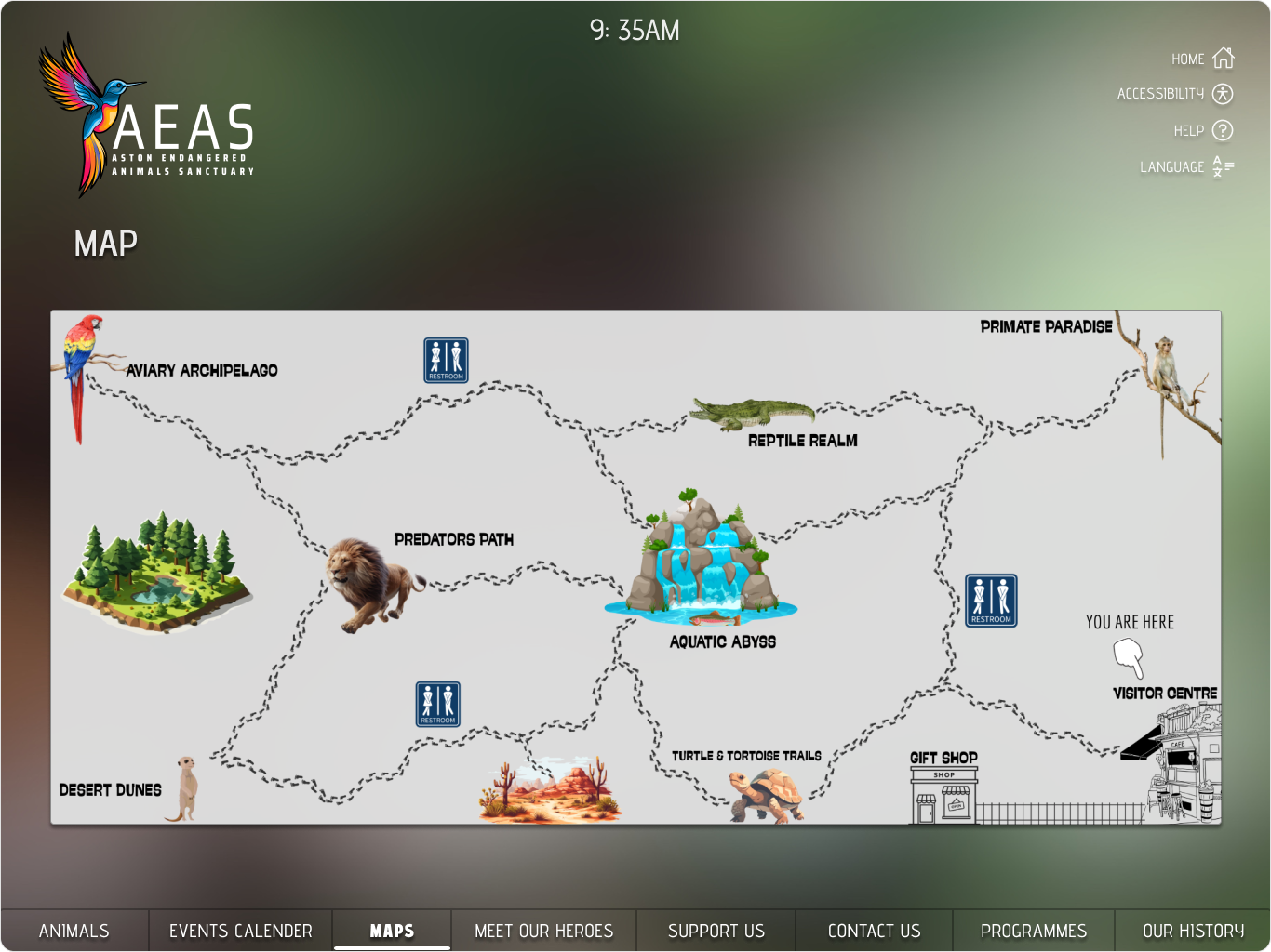
- Visitors prefer image-based categories and map-based exploration.
- Accessibility features (text size, contrast, language options) improve engagement and retention.
I leaned on principles from Preece, Rogers & Sharp (2019) - Interaction Design: Beyond Human-Computer Interaction:
- Visibility , keep key actions clearly visible.
- Feedback , confirm every interaction visually.
- Consistency , maintain predictable layouts and flows.
- Affordance , ensure interactive elements signal how to use them.
Design & Process
1. Concept Development
- Defined personas: Casual Visitor, Research Enthusiast, Sanctuary Supporter.
- Mapped user journeys for exploring animals, checking events, and donating.
- Sketched low-fidelity wireframes before refining them in Figma.
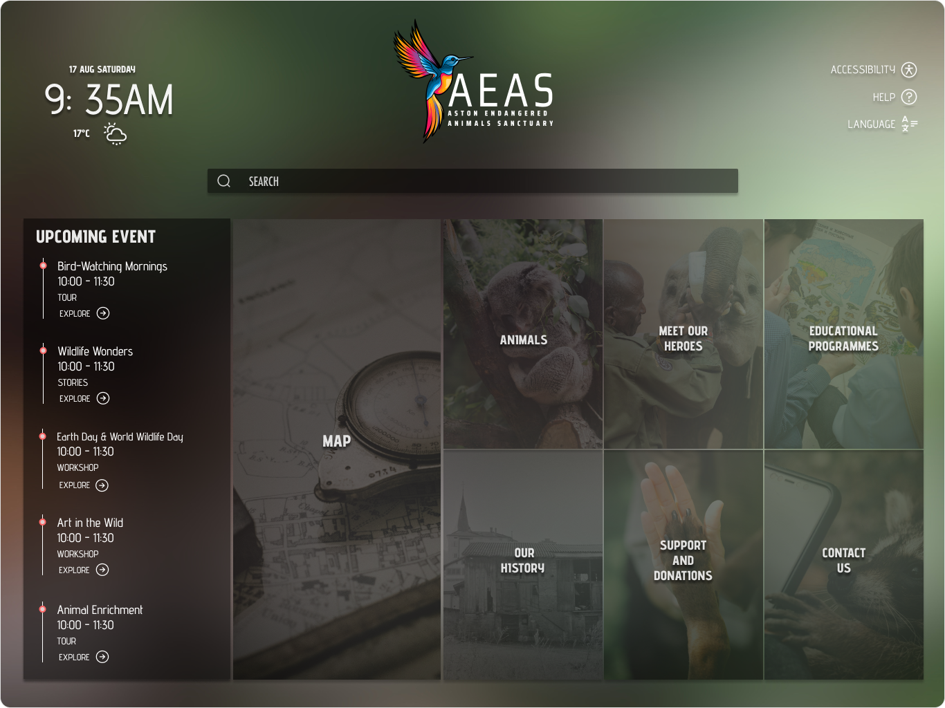
2. Structure & Navigation
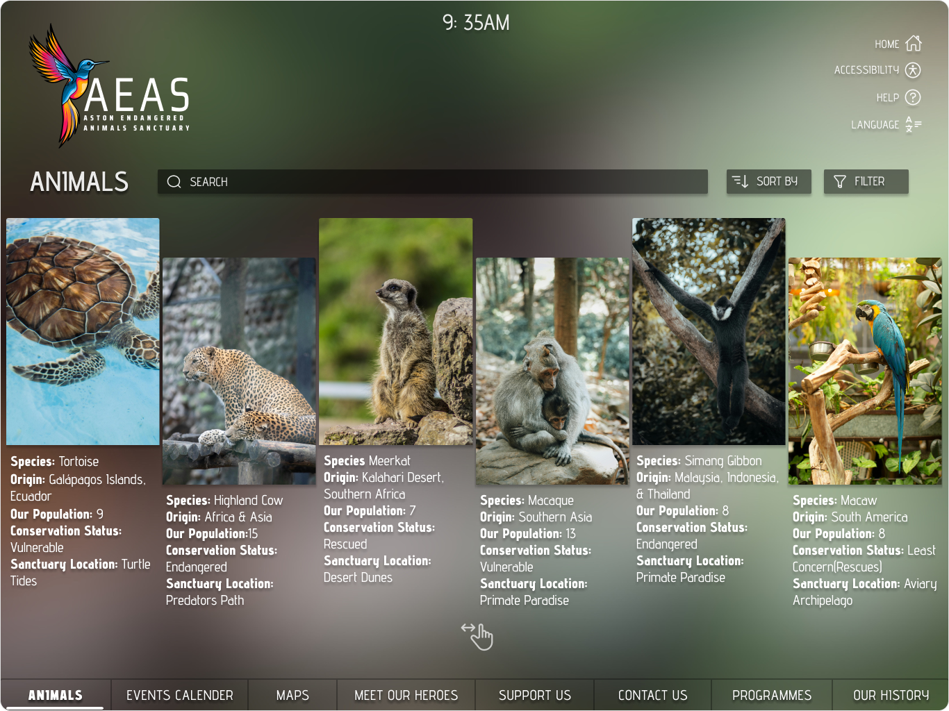
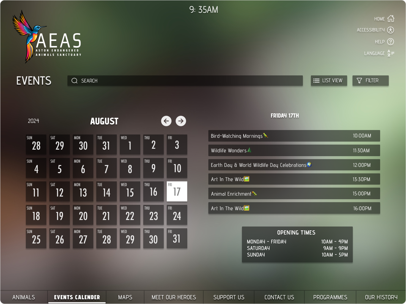
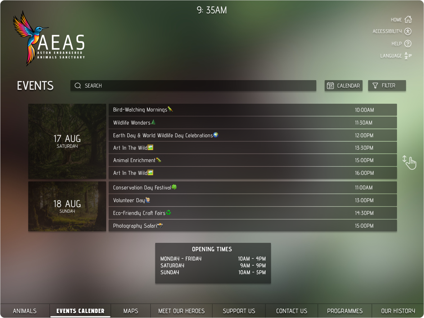
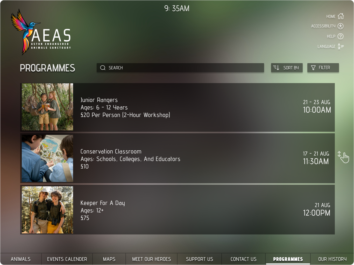
- Home screen: clear grid layout featuring Animals, Events, Programmes, History, Support Us.
- Information pages: modular cards for species, event listings, and staff highlights.
- Accessibility panel: adjustable text size, brightness, and language selection.
3. Visual & Interaction Design
- Designed in Figma with clean layouts, legible typography, and touch-friendly components.
- Used neutral, natural tones and subtle gradients to reflect the sanctuary identity.
- Added micro-interactions and QR links to extend the experience to personal devices.
4. Testing & Refinement
- Conducted informal usability sessions with peers to test clarity, hierarchy, and feedback.
- Simplified navigation labels and improved visual hierarchy based on feedback.
- Optimised accessibility features, including contrast ratios and larger hit areas.
Solution
- Browse animals, events, and programmes seamlessly.
- Learn about conservation efforts through structured information and visuals.
- Adjust accessibility preferences for a personalised experience.
- Continue engagement beyond the kiosk via QR integration.
Outcome
- Received strong academic feedback for clarity, interaction flow, and accessibility.
- Demonstrated the ability to design for broad audiences and public environments.
- Strengthened skills in information architecture, prototyping, and inclusive design.
Project Details
UX & Interaction Designer
Mar - May 2025
Interaction Design Project
Figma, Adobe Illustrator, Photoshop
Interaction Design, Accessibility, Information Architecture, Visual Storytelling