Lift
A concept fitness platform exploring how gyms, members, and coaches could be connected through one mobile-first operating system.
I designed Lift as a dual-sided product that combines personalised workouts, recovery insights, machine-specific guidance, coach-created content, and gym services into a single scalable experience.
Overview
Lift began as an exploration into how fragmented the modern gym experience has become. Most users rely on separate apps for workout tracking, recovery monitoring, nutrition, coaching, gym access, and educational content.
At the same time, gyms often lose the relationship with members once they leave the building. That gap revealed an opportunity to design a product that works as both a member-facing experience and a digital infrastructure layer for gym operators.
Rather than building another workout tracker, I reframed the product as a fitness operating system that could support training, recovery, education, and gym engagement inside one coherent platform.
Project focus
Role
Product Designer / UX Designer / Product Thinker
Responsibilities
Product strategy, UX design, information architecture, feature definition, systems thinking
Type
Concept product / mobile-first fitness platform
Constraints
Needed to work for both gym partners and independent users without relying on expensive hardware
Outcome
A scalable product concept for both independent users and gyms
Problem
Fitness products tend to solve one narrow part of the experience well, but rarely connect to the gym environment itself. Members end up stitching together tools for workouts, nutrition, recovery, coaching, and access.
The design question
How might we create a single platform that supports training, recovery, education, and gym engagement while staying simple enough for daily use?
Constraints
Process
I approached Lift as a product discovery exercise first, then moved into interface design. Before drawing screens, I collected signals from existing fitness apps, gym workflows, training habits, and the common gaps between workout tracking, recovery tools, coaching content, and the physical gym environment.
That research helped me define the core opportunity: users do not just need another logbook. They need a clearer system that connects what they plan to do, what they actually do in the gym, how they recover, and what guidance they need next.
1. Data collection
Mapped the product space across workout trackers, recovery apps, coaching tools, gym services, and machine guidance to understand what users currently stitch together.
2. Research synthesis
Grouped findings into recurring needs: daily training clarity, beginner-friendly machine support, progress visibility, recovery context, and gym-to-member engagement.
3. Wireframing
Explored early flows for home, workouts, guides, progress, and account areas in low fidelity before committing to visual design decisions.
4. Interaction model
Reduced the navigation around repeat daily actions, keeping common tasks close while making deeper gym content available when users need it.
5. Visual direction
Developed a mobile-first interface direction that felt practical for gym use: high contrast, clear hierarchy, quick scanning, and readable progress states.
6. Product refinement
Reframed Lift from a workout tracker into a broader platform that could serve independent users while also scaling into gym partnerships.
Wireframes
The early Lift flows and structure were mapped in Whimsical before moving into higher-fidelity screen design.
Product strategy
Lift was intentionally designed as a dual-sided platform. That meant creating value for both members and gym operators without turning the product into two disconnected experiences.
Independent users could subscribe directly and access a generic training ecosystem, while gym-based users would unlock their gym’s exact machines, coaches, articles, and services through a participating partner.
Gym members
- Gym-specific machine catalogue and guidance.
- Coach-created workouts and educational content.
- Membership-linked services and QR-based access.
- Recovery, readiness, and progress insights.
Independent users
- Generic machine catalogue and workout generation.
- Progress tracking and training history.
- Recovery scoring with optional health integrations.
- A standalone experience that can still scale into gym partnerships.
Design decisions
Information architecture
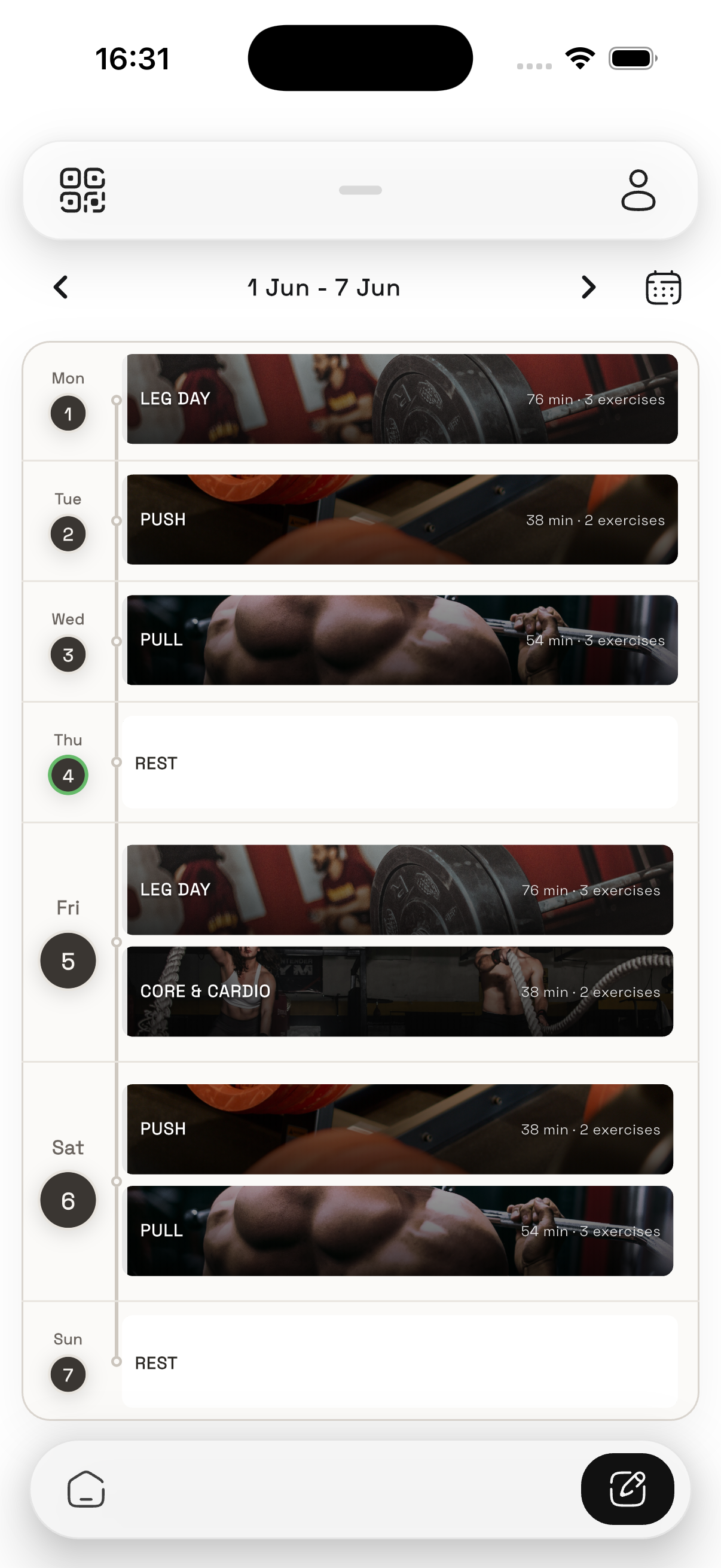
I started by identifying the actions users would perform most often. That led to a simple navigation model built around Home, Workouts, Guides, Progress, and Account, with the goal of keeping common tasks within two taps.
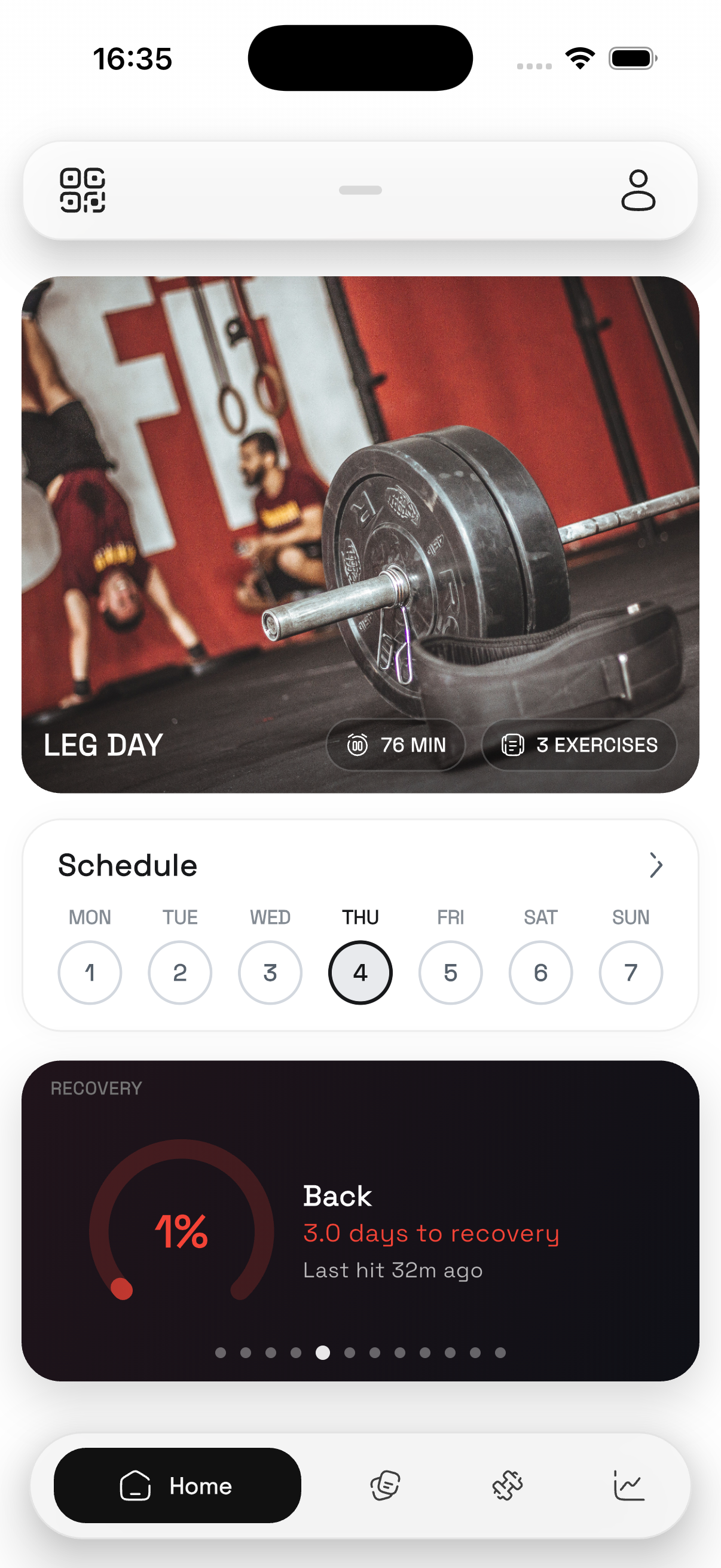
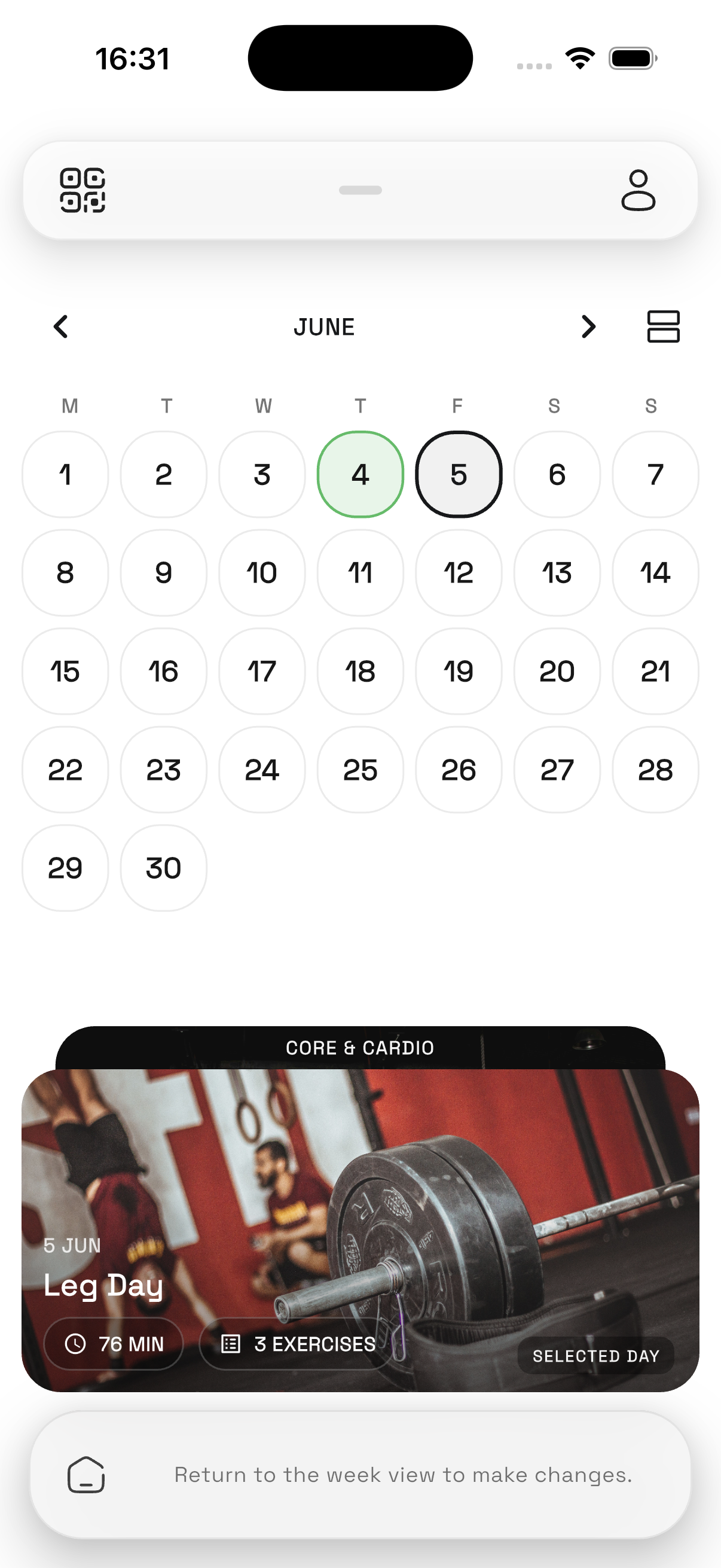
Home experience
The home screen was centred on three practical questions: what should I do today, how consistent have I been, and how recovered am I. This helped prioritise actions over noise and gave the interface a clear daily purpose.
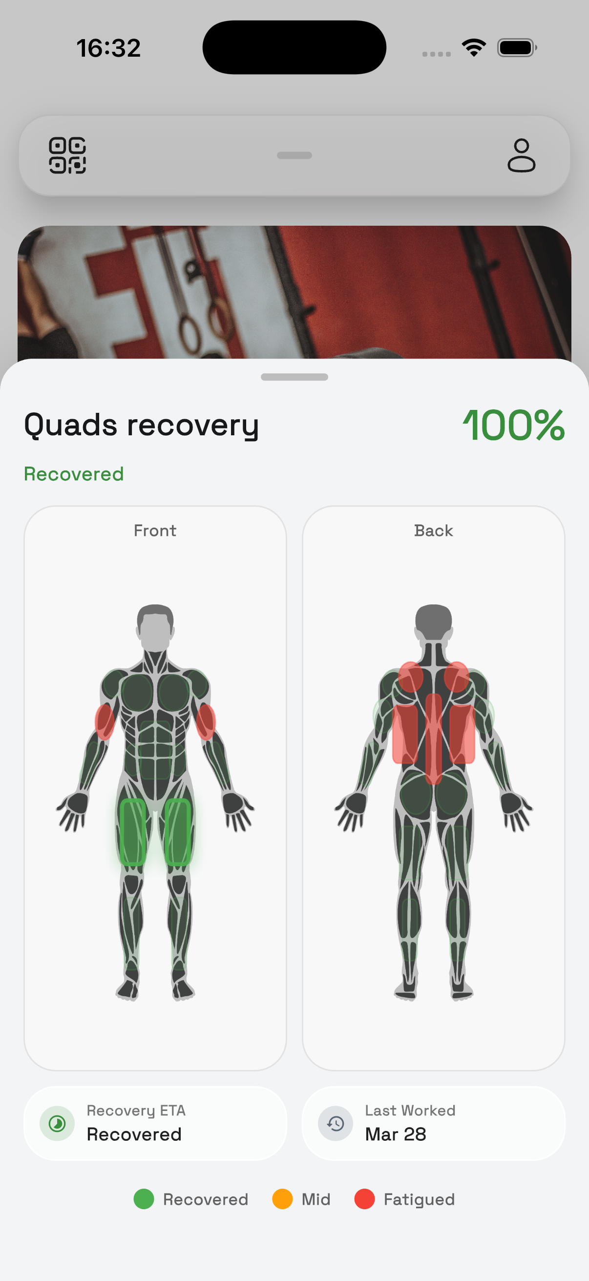
Recovery intelligence
Recovery was designed as a layered system. A base score could work from training volume, intensity, muscle fatigue, and consistency alone, while an enhanced version could incorporate Apple Health, Health Connect, sleep, and nutrition data when available.
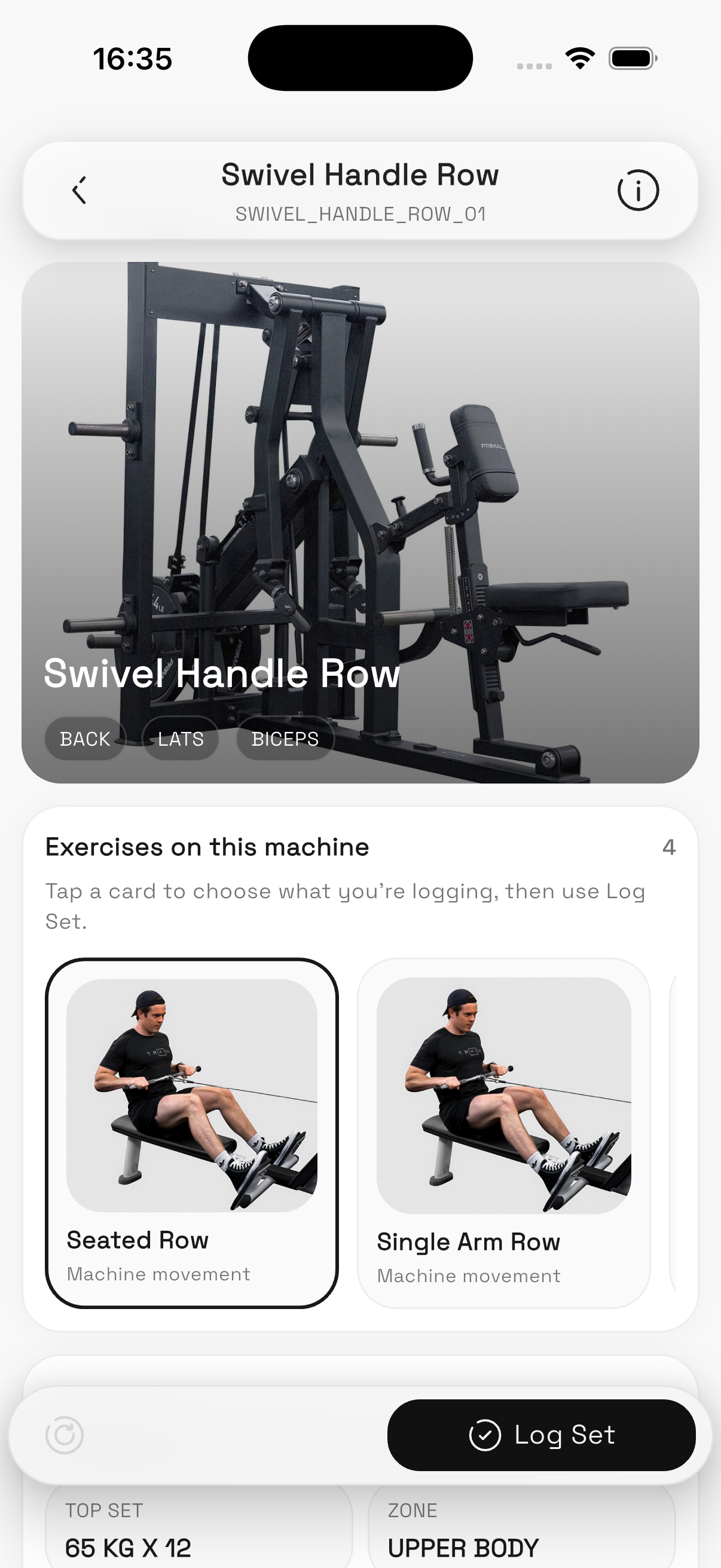
Machine-aware gym integration
One of the strongest differentiators was treating each machine as a digital object with instructions, muscle groups, exercise guidance, QR access, and performance history. That bridged the gap between the physical gym floor and the digital experience.
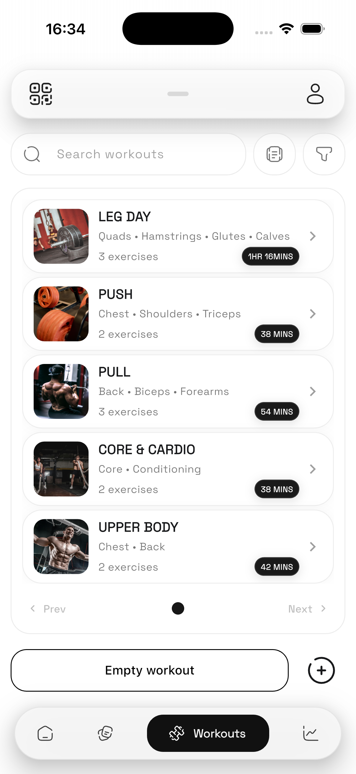
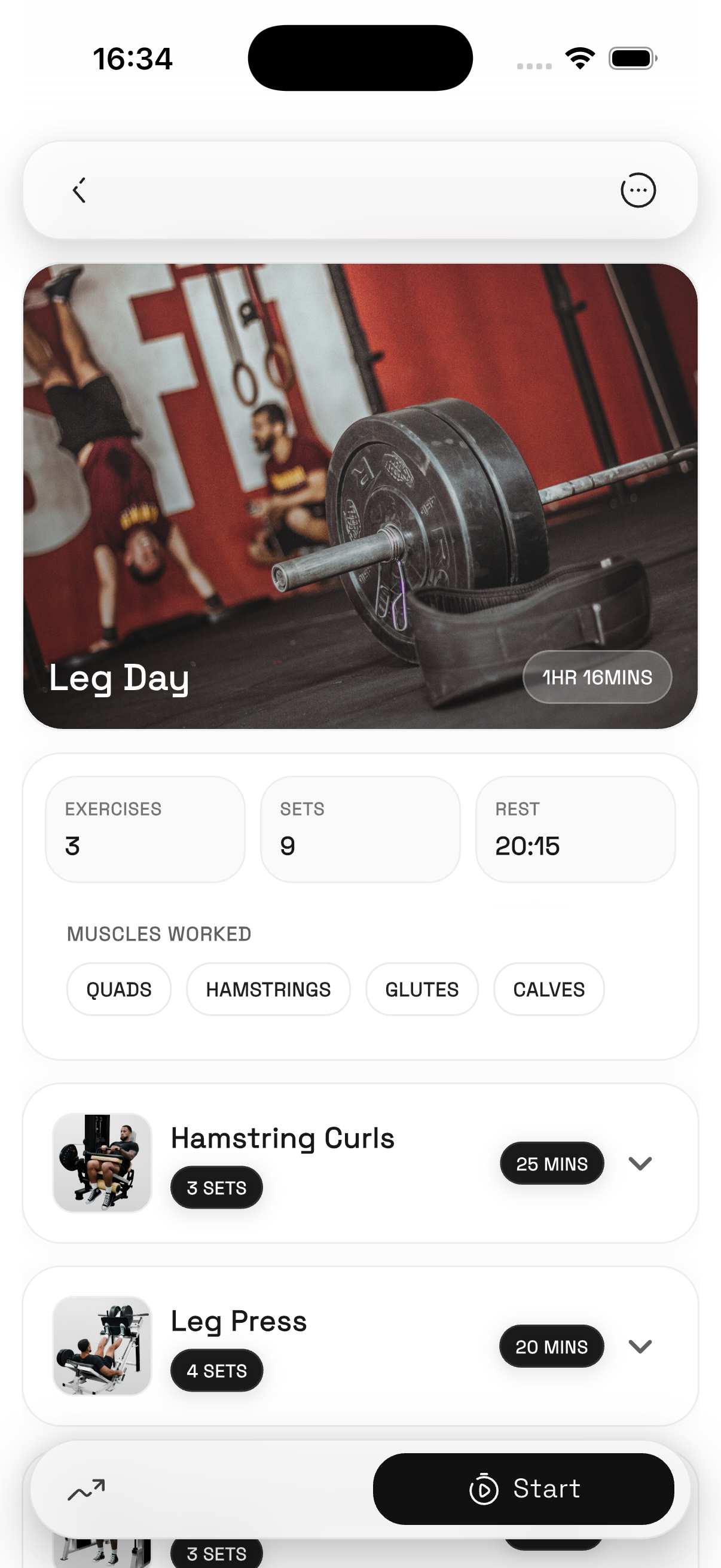
Selected screens
A snapshot of the interface direction across training, recovery, gym services, and member engagement.
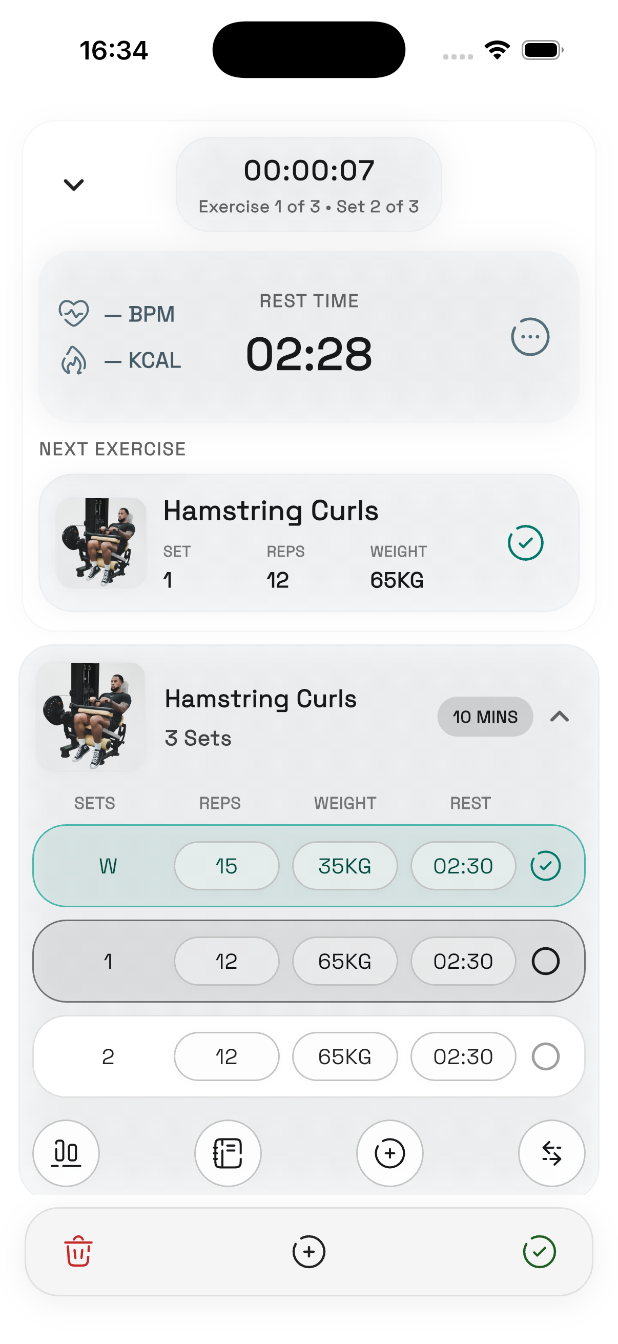
Daily training layer
The product starts with clear daily actions instead of overwhelming users with disconnected metrics.
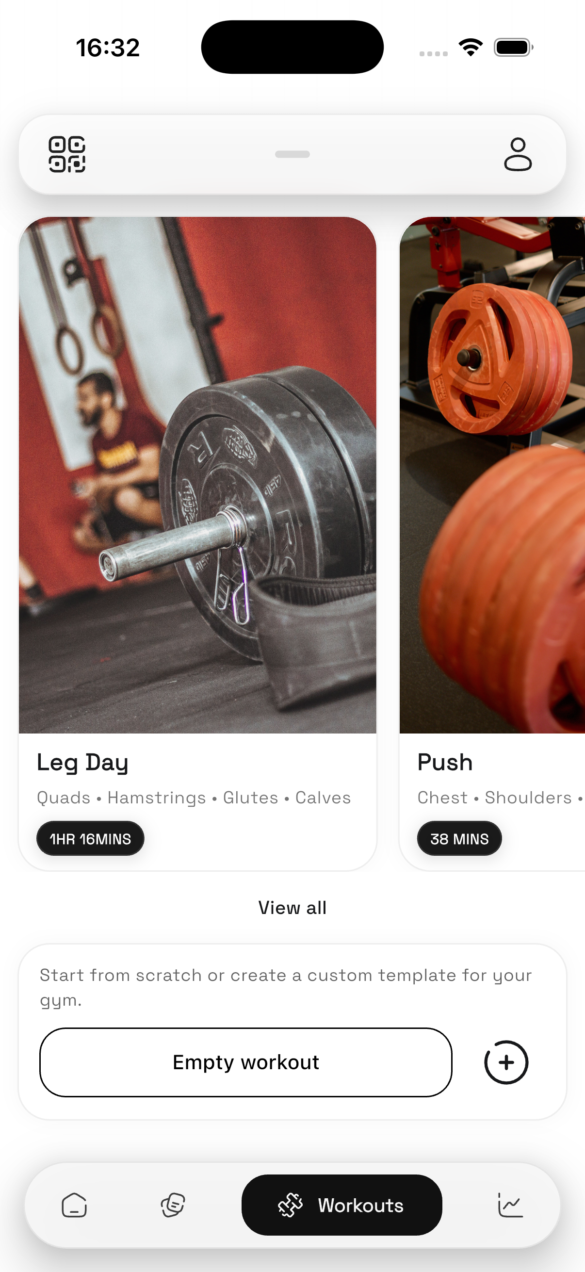
Workout guidance
Workout tracking was reframed as one part of a broader gym ecosystem rather than the entire product.
Progress visibility
Progress features were designed to feel readable and encouraging rather than overly technical.
Recovery intelligence
Recovery is translated into a simple readiness layer using training behaviour first, with optional health integrations on top.
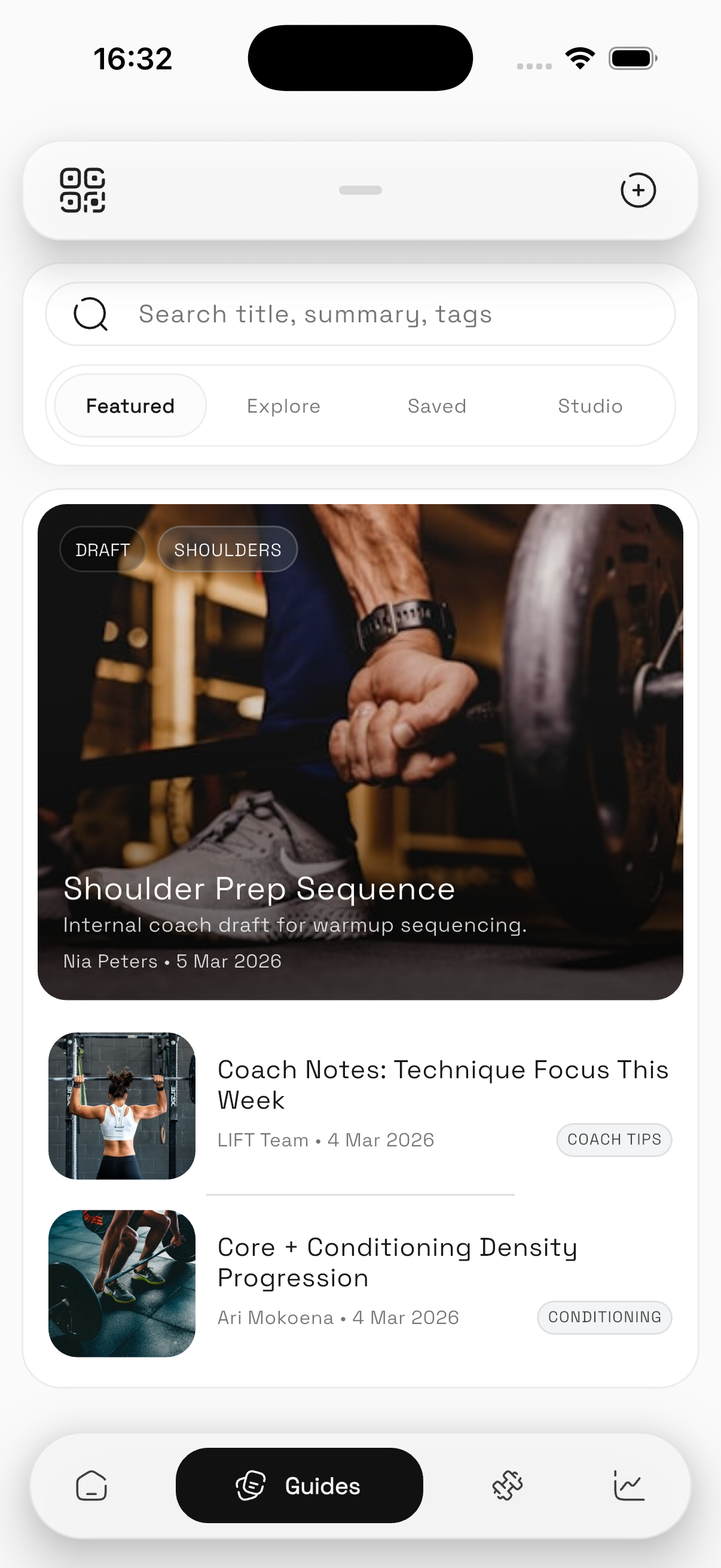
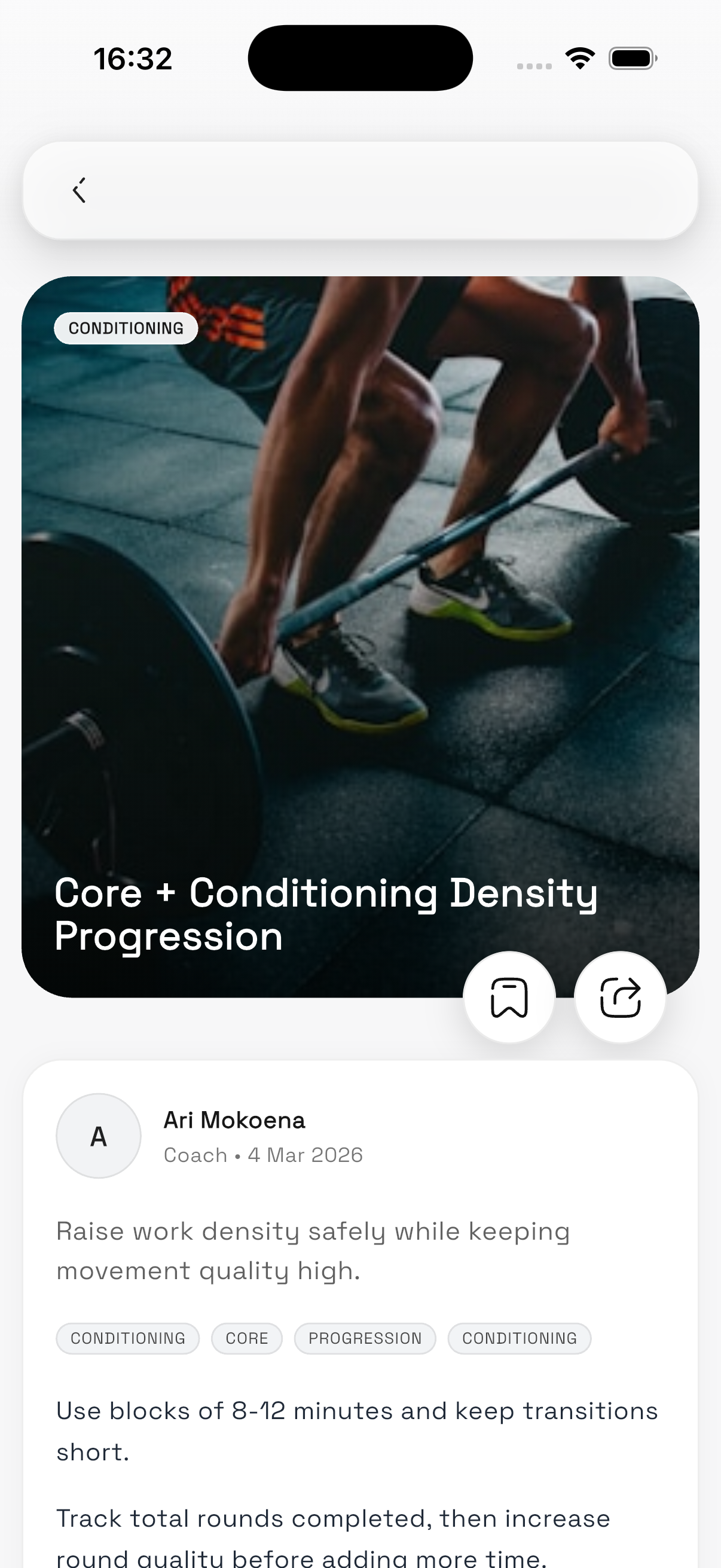
Coaching context
The experience was shaped to support coach-created content and machine-aware recommendations inside the app.
Content delivery
A digital layer for gyms makes education, articles, and services available beyond the physical gym floor.
Single ecosystem
The platform brings training, recovery, education, and gym access together in one coherent system.
Behaviour over noise
The goal was to give users enough context to make better training decisions without creating data overload.
Technical architecture
Although Lift is a concept project, I designed it with implementation realism in mind. I wanted the system to feel credible from both a product and engineering perspective, so the experience was shaped by what could realistically scale rather than by interface ideas alone.
The platform was mapped as a multi-tenant product that could support multiple gyms inside one shared system while still allowing each location to manage its own machines, coaches, content, and services. That meant thinking beyond screens and into how data, permissions, and product logic would need to work underneath the interface.
Outcome
Lift evolved from a workout-tracking idea into a broader platform concept for modern gyms. The project helped me explore how product strategy, systems thinking, and interface design can come together inside a single software idea.
More importantly, it reflects how I approach digital products: not just as screens, but as connected systems shaped by user needs, business opportunities, and technical reality.
What I’d build next
If I took Lift further, the next step would be validating the product with real gym operators and members to test where the strongest retention value sits: recovery insights, machine guidance, or gym-linked services.
I would also define the MVP data model more explicitly, map key service flows such as onboarding and gym setup, and prototype the coach and operator side of the platform in more detail so the ecosystem feels as strong operationally as it does for members.